

Most shop owners strive to make their business responsive to their customers’ service needs by offering convenient hours of operation, an attentive staff and even a comfortable waiting room. But, your website, the one part of your business that is open 24 hours a day, 365 days a year, may be overlooked. Have you taken steps to ensure it is “responsive”?
When talking in terms of website responsiveness, I am referring to whether or not your website provides a clean, easy-to-use interface for users who visit your website on a mobile device such as a smartphone or tablet.
Why This Matters to You
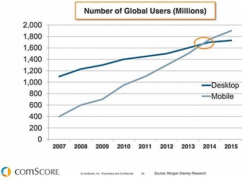
Statistics don’t lie. Data shows that in late 2014, for the first time, consumers of digital media (websites, apps, etc.) were doing so on mobile devices like smartphones and tablets more frequently than they were on desktop computers. So, for a business owner, that means that a significant portion of the traffic on your website could be being viewed on one of these portable devices. The question, then, is what type of user experience are your customers having on the mobile version of your website? This requires your attention because if 50% or more of the visitors to your website can’t view relevant information or use the service scheduler, for example, you may be losing business you don’t even know about.
Google Matters
In 2016, Google announced that it would begin penalizing websites that do not offer a mobile-responsive Web experience to its users. This means that your business website could be suffering in search results, meaning fewer visits to your website and fewer opportunities for you to attract customers.
Short Attention Span
Web users have a very short fuse when it comes to their browsing experience. So, if your website does not make it easy for them to find the information they are looking for, contact you or complete a service request, they will quickly move on to a competitor who does provide a fluid, responsive Web experience on their mobile device.
So, what steps should you take to make sure you are doing all you can to provide a responsive mobile experience for your customers?

Here are the top three tips for maximizing your customers’ mobile experience:
1. Check Analytics: If you don’t already have it installed, you should be monitoring website traffic using the free tool, Google Analytics. Within Google Analytics, you can select a time period, then click on Audience > Mobile > Overview and this will tell you the percentage of your web traffic being viewed on desktop, mobile or tablet devices. If this number is higher than 30%, you need to take action.
2. Test, Test, Test: There are many devices and varied browsers your customers may use. Do your own tests to see how your site looks. Browse your website on your own smartphone or tablet, and borrow a friend’s phone so you can test it on both iPhone and Android devices. Is the page garbled? Do you have to zoom in to see the information? Is all of the functionality you would expect to be operating smoothly on the desktop version working properly on various devices?
3. Adapt and Update: If your website is built in a framework like WordPress or Drupal, there are many inexpensive themes available that have mobile-responsiveness built in, and are even designed around business themes for automotive professionals. ThemeForest.net is one of the larger framework sites that has themes available for less than $60, in most cases. If you don’t feel comfortable working on your website yourself, contact the original designer of your website or another local Web designer to assist.
Your website is often the first interaction your customers have with your business. Make sure you are putting your best foot forward by providing them with a seamless, easy-to-use experience across all potential devices. Otherwise, you risk losing business by failing to be responsive to your customers’ needs.


